
Box
The Box is a generic container for layout, background media, actions, or validation boundaries. Use it to group fields into one form section or to make a clickable content card.
Properties
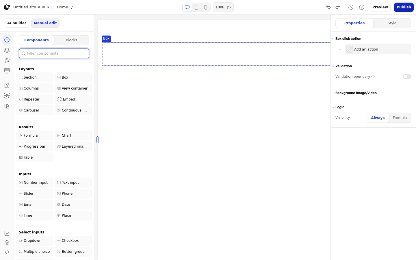
The properties live in the inspector under the Box group. In the Site editor the Box has the following properties.
Property | What it does | Default |
|---|---|---|
Box click action | Runs an action when the Box is clicked | Empty |
Validation boundary | Groups fields so validation applies to the Box as a boundary | Off |
Background image/video | Sets an image or video as the Box background | None |
Logic | Controls when the Box is visible | None |
The Document editor differs. Box click action and Validation boundary are absent, and Avoid page break appears instead, default Off. In the Site editor the background accepts image and video assets; in the Document editor it accepts only images.
References
The Box has no data references. It does not expose a value you can use in formulas or other elements.
Styling
The Box can be styled per state and per part of the element.
Style states: Default, Hover.
Named targets: wrapper, background-image.
Background styling appears only when a background asset is set on the Box. The Site editor has no built-in style set or quick-style provider for the Box. The Document editor uses the Box quick-style set, which covers Width, Max width, Min width, Height, Max height, Min height, Placement, Top, Right, Bottom, Left, Direction, Columns, Rows, Horizontal align, Vertical align, Gap, Padding, Margin, Background, Border, Border radius, Box shadow, Image fit, and Aspect ratio.
Related articles
UI Elements: overview of the elements.
FormulaScript Overview: using formulas in properties.