
Number input
The Number input collects a numeric value from visitors, formatted as a plain number, a currency, or a percentage. Use it whenever you need a precise figure that is not a good fit for a slider, for example an area, a budget, a number of units, or a monthly bill.
Properties
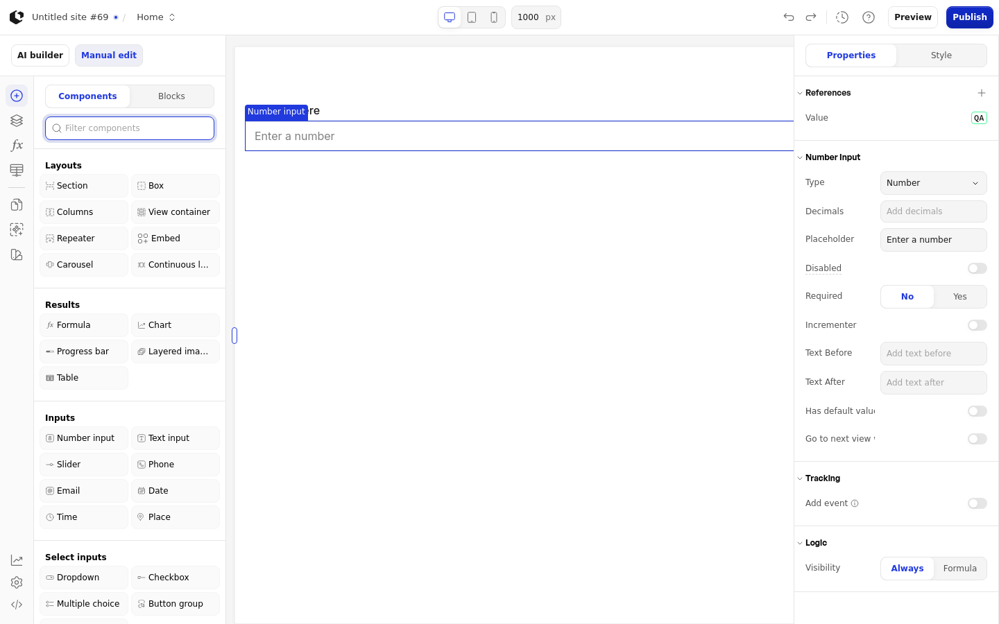
The properties live in the inspector under the Number input group. Several fields are conditional: they appear only when a related property is set.
Property | What it does | Default |
|---|---|---|
Type | Formats the value as a number, currency, or percentage | Number |
Currency | Currency symbol shown when Type is Currency; options include Euro, Dollar, Pound Sterling, Yen, Ruble, Indian Rupee, Shekel, Lira, Baht, and more | Conditional |
Decimals | Number of decimal places shown, minimum 0 | 2 |
Placeholder | Hint text shown before the visitor types | Enter a number |
Disabled | Prevents visitors from entering a value; accepts a boolean or a formula | Off |
Required | Requires the visitor to fill in the field | Off |
Incrementer | Shows up and down buttons next to the input | Off |
Incrementer Step | Amount the value changes per incrementer click, minimum 0 | Conditional |
Text before | Text shown before the value | Conditional |
Text after | Text shown after the value | Conditional |
Has default value | Enables a value the input starts with | Off |
Default | Starting value, a number or a formula | Conditional |
Go to next view when answered | Advances to the next view once the visitor answers | Off |
Logic | Visibility logic that controls when the input shows | Empty |
Currency appears only when Type is Currency. Incrementer Step appears only when Incrementer is on. Text before appears only when Type is Number or Percentage; Text after appears only when Type is Number or Currency. Default appears only when Has default value is on. Disabled and Default accept a formula.
References
References expose the visitor's answer as data you can use in formulas and other elements. Assign a reference to store the input's value in a variable.
Value: the current input value.
Filled: whether the visitor has entered a value.
Touched: whether the visitor has interacted with the input.
Last touched at: when the visitor last interacted with the input.
Styling
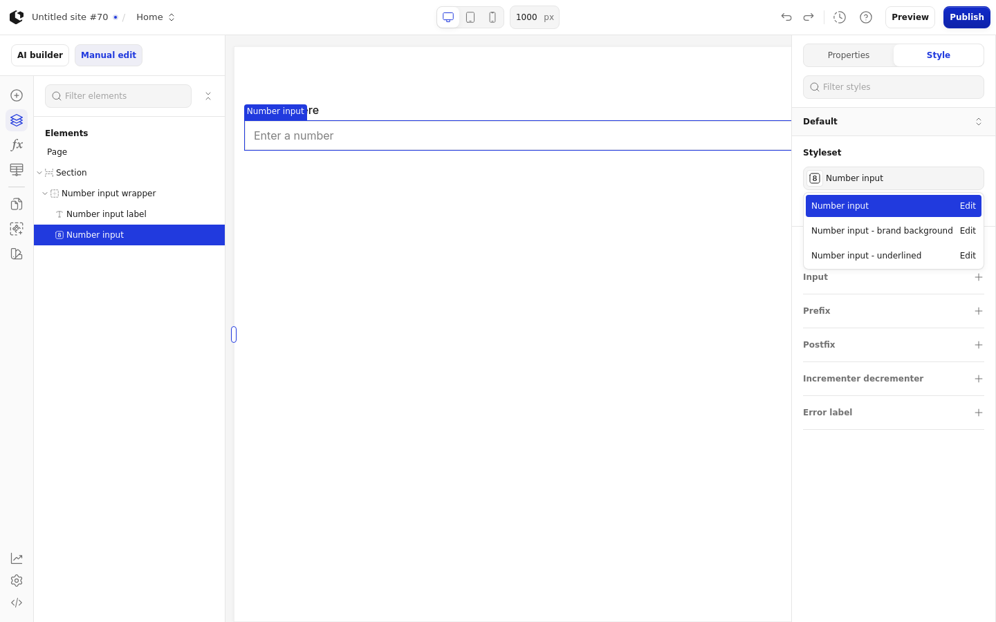
The Number input can be styled per state and per part of the element.
Style states: Active, Default, Disabled, Error, Focus, Hover, Placeholder.
Named targets: wrapper, input, prefix, postfix, incrementer_decrementer, error-label.
Named styles: Number input, Number input - brand background, Number input - underlined.
Hover styling applies to the incrementer buttons rather than the main input. The Site editor does not confirm a quick style provider for this element.
Related articles
UI Elements: overview of the elements.
FormulaScript Overview: using formulas in properties.