
Button group
The Button group presents options as buttons. Use it for a quick choice between product tiers, service packages, or time intervals.
Properties
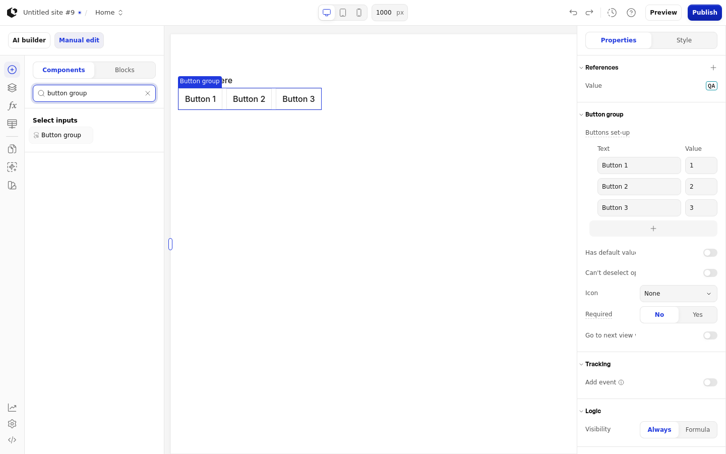
The properties live in the inspector under the Button group group.
Property | What it does | Default |
|---|---|---|
Buttons set-up | The buttons the visitor can choose from; accepts records or a Formula. Each record has a Text field for the button label and a Value field for the value it stores. In Formula mode, the Label and Value columns define the button text and value, with columns from A to Z. | Button 1 -> 1, Button 2 -> 2, Button 3 -> 3 |
Has default value | Whether a button is already selected before the visitor answers | No default set |
Conditional Default | The button selected by default; appears only when Has default value is on, is clearable, and shows the placeholder "No default" | No default set |
Can't deselect option | Prevents the visitor from deselecting a chosen button | Not set |
Icon | Where an icon appears on the button: None, Left, or Right | None |
Required | Whether the visitor must answer before continuing | False |
Go to next view when answered | Moves the visitor to the next view once they choose a button | Not set |
Logic | Conditional behavior for the element | Not set |
Has default value, Conditional Default, and Can't deselect option have no default set. Buttons set-up accepts records or a Formula.
References
References expose the visitor's answer as data you can use in formulas and other elements. Assign a reference to store the button group's answer in a variable. All references use the Q prefix.
Value
Label
Count
Touched
Matrix
Last touched at
Styling
The Button group can be styled per state and per part of the element.
Style states: Active, Checked, Default, Error, Focus, Hover. There is no Disabled state.
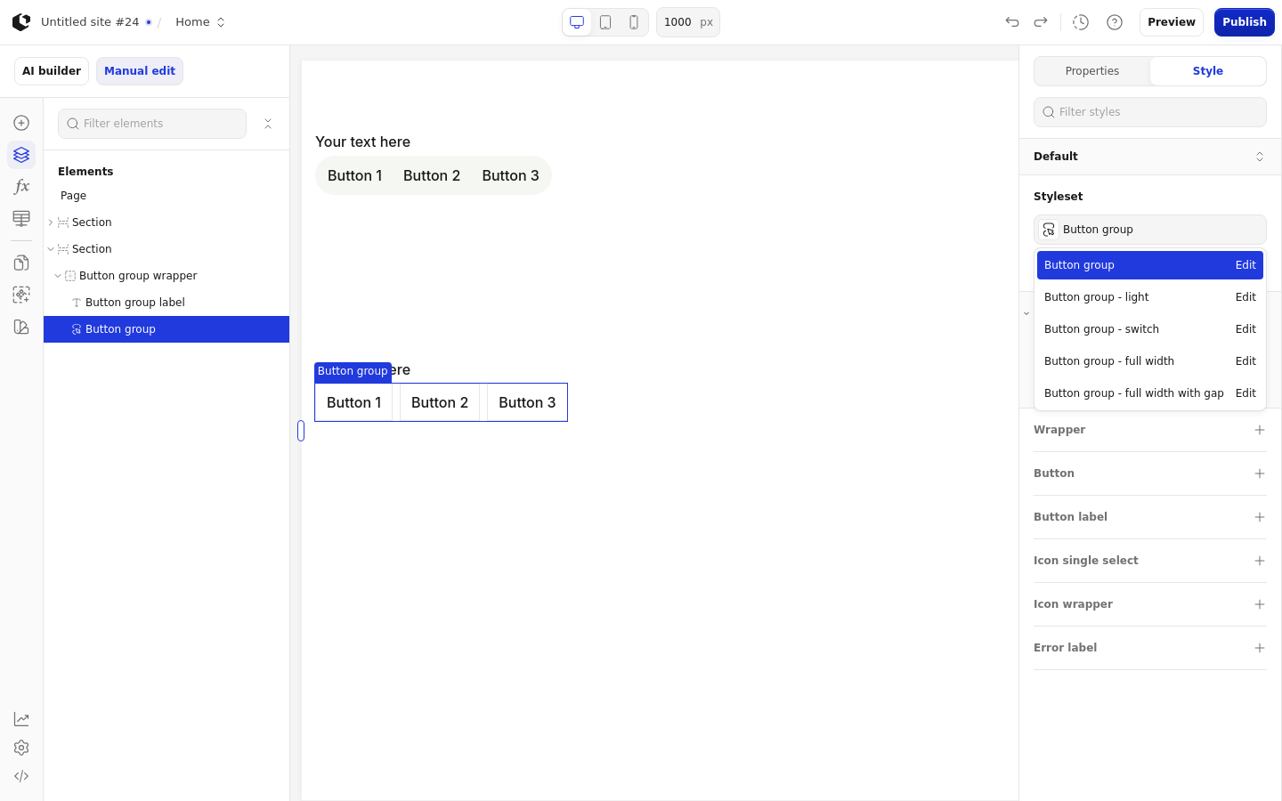
Named targets: wrapper, button, button-label, icon-single-select, icon-wrapper, error-label.
Named styles: Button group, Button group - light, Button group - switch, Button group - full width, Button group - full width with gap.
The Button group has no quick styles. Apply general styling from the Style tab: style sets and CSS overrides per state and per breakpoint.
Related articles
UI Elements: overview of the elements.
FormulaScript Overview: using formulas in properties.