
Link
The Link element runs a navigation or other click action when a visitor clicks it. Use it to send visitors to an internal section, an external website, or the next step of your funnel.
Properties
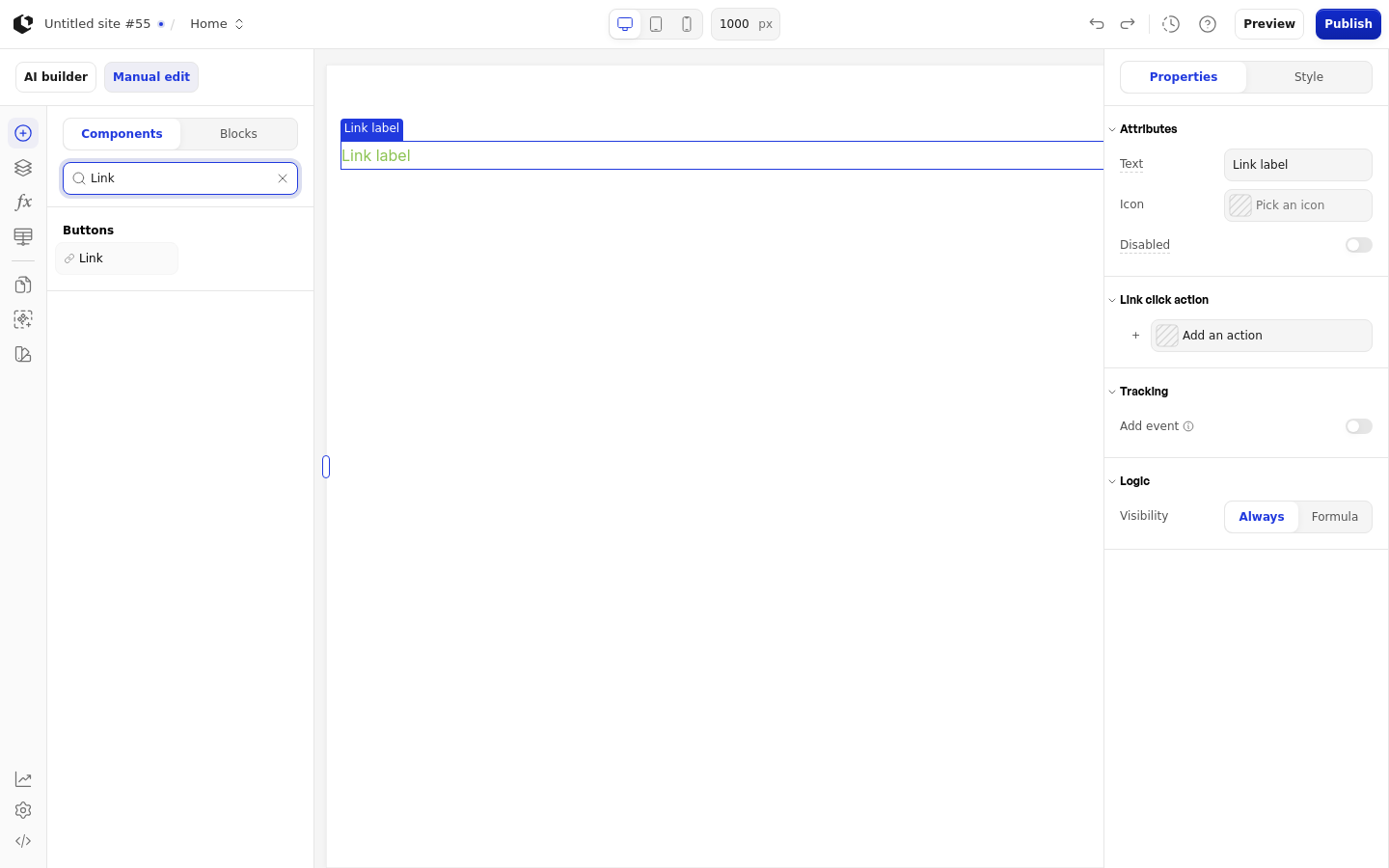
The properties live in the inspector under the Link group.
Property | What it does | Default |
|---|---|---|
Text | Label shown on the link | Link label |
Icon | Icon shown next to the label | Empty |
Disabled | Prevents visitors from clicking the link | Off |
Link click action | Action that runs when the link is clicked | Empty |
Logic | Conditions that control when the link is shown | Empty |
References
The Link element has no data references, so it exposes no values you can use in formulas or other elements. Navigation attributes are only added in Preview or Live when the navigation resolves.
Styling
The Link can be styled per state and per part of the element.
Style states: Active, Default, Disabled, Focus, Hover, Visited.
Named targets: wrapper, link, icon.
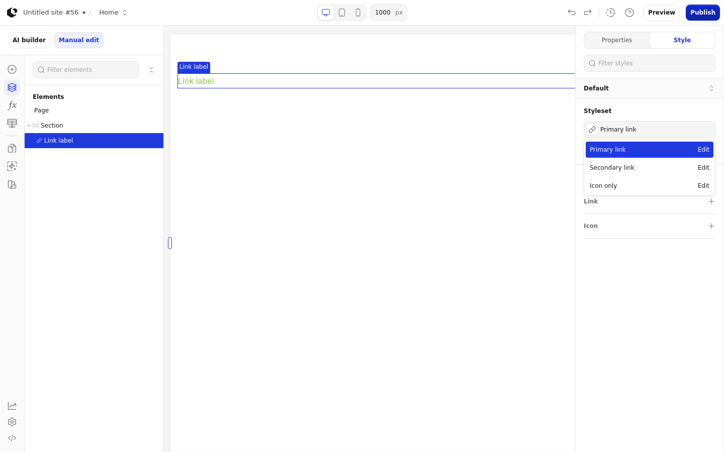
Named styles: Primary link, Secondary link, Icon only.
Quick styles: Icon color, Icon Placement.
Apply general styling from the Style tab: quick styles, style sets, and CSS overrides per state and per breakpoint. See the styling reference for the full system. The Link has no button response or error state.
Related articles
UI Elements: overview of the elements.
FormulaScript Overview: using formulas in properties.