
Checkbox
The Checkbox collects a yes/no or consent choice from the visitor. Use it for consent, an extra service, or an opt-in where the visitor confirms or declines a single option.
Properties
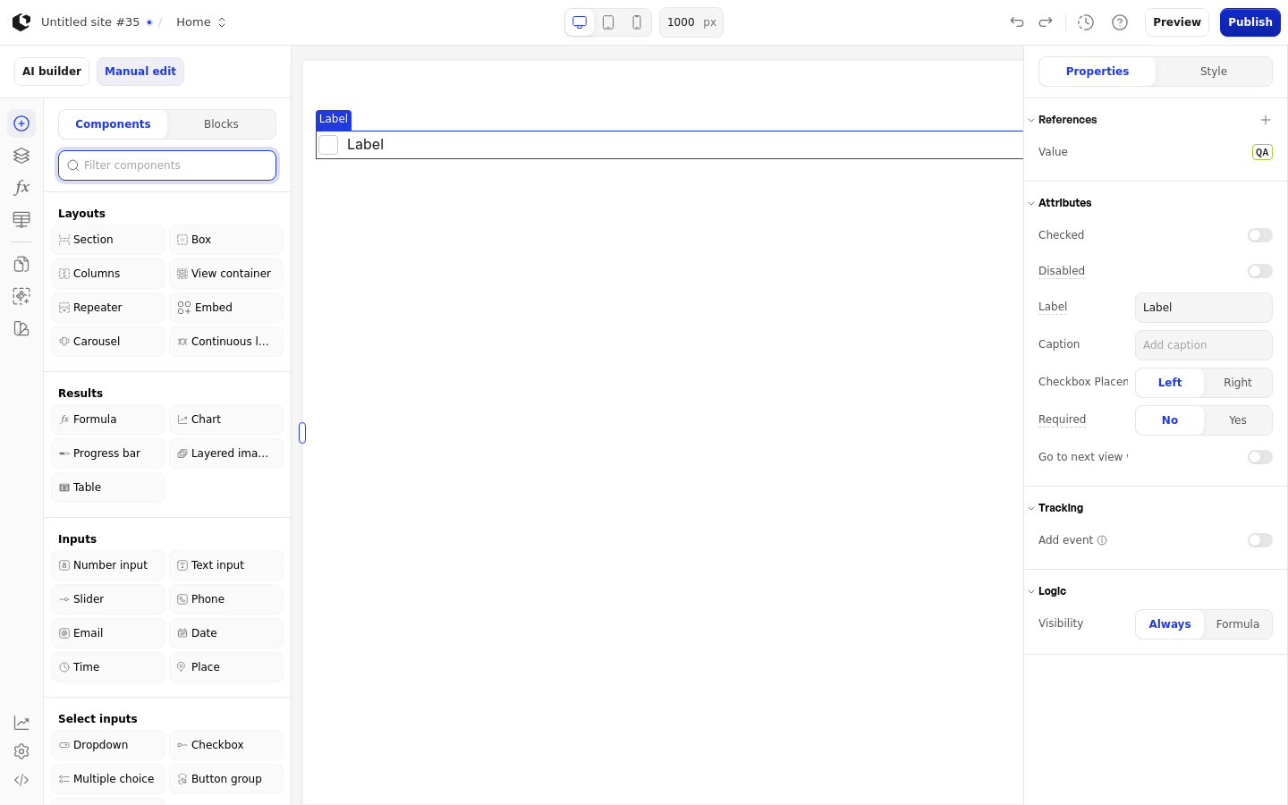
The properties live in the inspector under the Attributes group, followed by the Logic group.
Property | What it does | Default |
|---|---|---|
Checked | Default checked state of the checkbox | Off |
Disabled | Prevents visitors from changing the checkbox | Off |
Label | Checkbox label text | Label |
Caption | Caption text below the label | Empty |
Checkbox Placement | Checkbox position relative to the label | Left |
Required | Whether the checkbox must be checked | Off |
Go to next view when answered | Moves the visitor to the next view when the checkbox is checked | Off |
Label, Disabled, and Required accept a formula. Checkbox Placement offers Left and Right. The Label field uses the placeholder "Add label" and the Caption field uses "Add caption".
References
References expose the visitor's answer as data you can use in formulas and other elements. Assign a reference to store the checkbox's value in a variable.
Value: 1 when checked, 0 when unchecked.
Touched: whether the visitor has clicked the checkbox.
Last touched at: when the visitor last clicked the checkbox.
The Checkbox has no Label, Count, or Matrix reference, and no default caption.
Styling
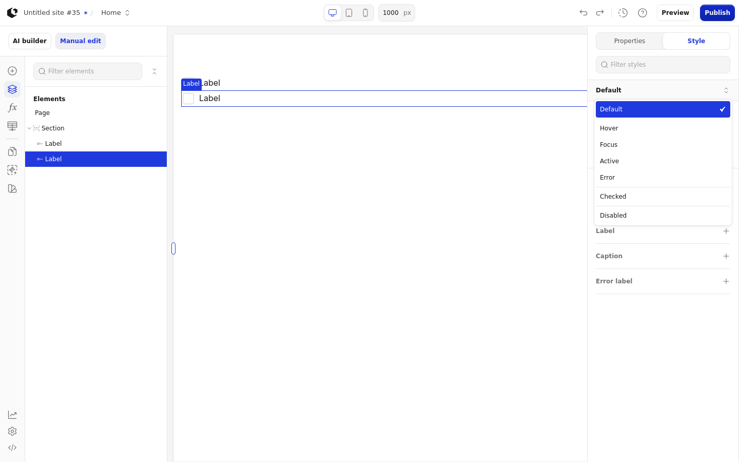
The Checkbox can be styled per state and per part of the element.
Style states: Active, Checked, Default, Disabled, Error, Focus, Hover.
Named targets: wrapper, checkbox, label, caption, error-label.
The built-in named style is Checkbox, which is the default style for the element. The Checkbox has no quick styles. Apply general styling from the Style tab: style sets and CSS overrides per state and per breakpoint. See the styling reference for the full system.
Related articles
UI Elements: overview of the elements.
FormulaScript Overview: using formulas in properties.