
Date
The Date element lets a visitor pick a date from a calendar component. Use it when you need a specific day from the visitor, for example a desired start date, an appointment date, or a booking day.
Properties
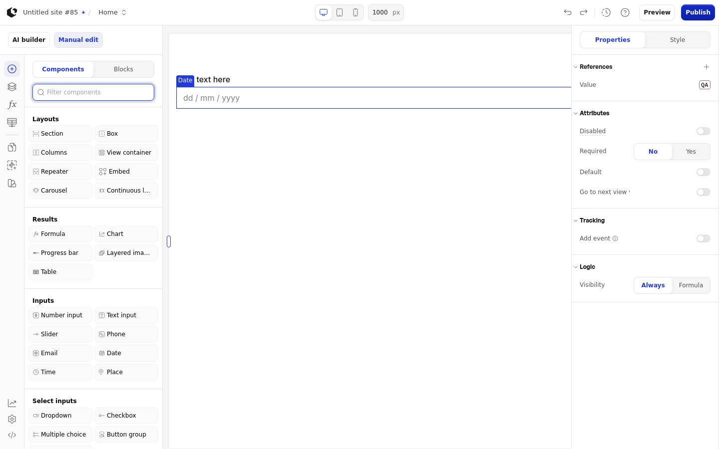
The properties live in the inspector under the Attributes group. Disabled accepts a boolean or a formula.
Property | What it does | Default |
|---|---|---|
Disabled | Prevents visitors from picking a date | Off |
Required | Forces the visitor to pick a date before continuing | Off |
Default | Use today as default value | Off |
Go to next view when answered | Moves the visitor to the next view once they pick a date | Off |
Under Logic, the Visibility control shows the element Always or only when a Formula is true. The Date element has no typed default date property: Default is a boolean that uses today's date, and there is no inspector placeholder property.
References
References expose the visitor's answer as data you can use in formulas and other elements. Assign a reference to store the picked date in a variable.
Value: the date the visitor picked.
Touched: whether the visitor has picked a date.
Last touched at: when the visitor last picked a date.
Styling
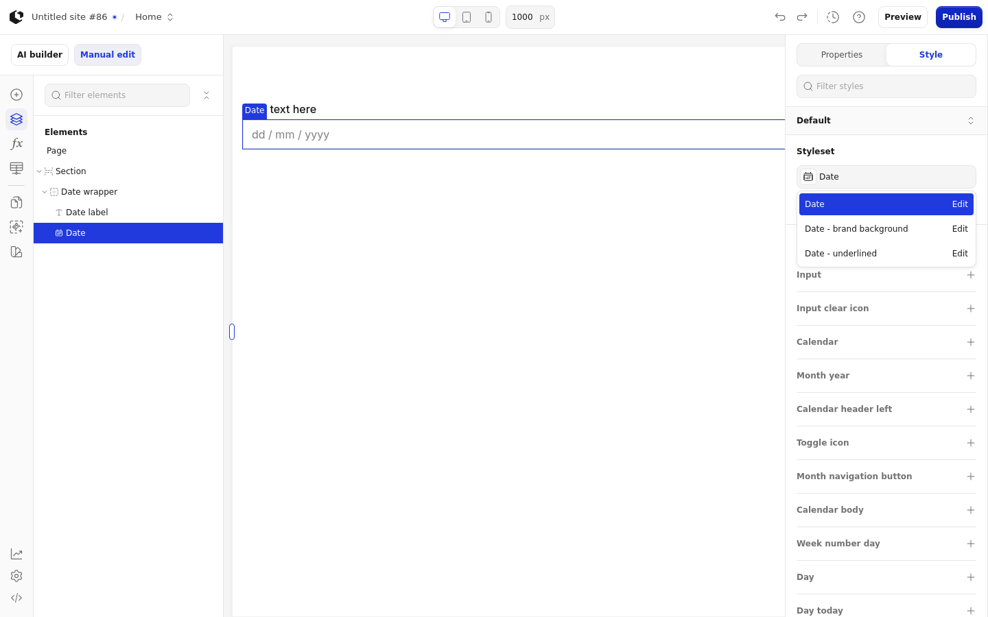
The Date element can be styled per state and per part of the element.
Style states: Active, Default, Disabled, Error, Focus, Hover, Placeholder.
Named targets: wrapper, input, input-clear-icon, calendar, month-year, calendar-header-left, toggle-icon, month-navigation-button, calendar-body, week-number-day, day, day-today, scroll-wrapper, option, option-today, error-label.
Named styles: Date, Date - brand background, Date - underlined.
Apply general styling from the Style tab: quick styles, style sets, and CSS overrides per state and per breakpoint. See the styling reference for the full system.
Related articles
UI Elements: overview of the elements.
FormulaScript Overview: using formulas in properties.