
The Email element collects and validates an email address. Use it for lead capture, a quote by email, or a confirmation message where you need a valid address before the visitor continues.
Properties
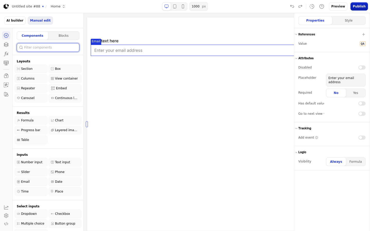
The properties live in the inspector under the Attributes group. Disabled and Required accept a Boolean or a Formula, and Default accepts text or a Formula.
Property | What it does | Default |
|---|---|---|
Disabled | Prevents visitors from entering an email address | No default |
Placeholder | Hint text shown in the field before the visitor types | Enter your email address |
Required | Makes the field required before the visitor can continue | Off |
Has default value | Enables the Default property | No default |
Default | Pre-fills the field with a value | Empty |
Go to next view when answered | Advances to the next view after a valid answer is committed | No default |
The Default field appears only when Has default value is on. Its placeholder is "Add your default here". The Placeholder field's placeholder is "Add placeholder".
References
References expose the visitor's answer as data you can use in formulas and other elements. Assign a reference to store the email in a variable. References use the question prefix Q.
Value: the email address the visitor entered.
Touched: whether the visitor has entered an email.
Last touched at: when the visitor last entered an email.
An invalid address is rejected and shows the error "Invalid email address", so Value stays empty until the visitor enters a valid address.
Styling
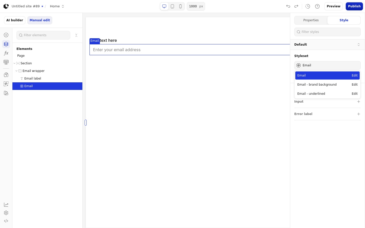
The Email element can be styled per state and per part of the element.
Style states: Active, Default, Disabled, Error, Focus, Hover, Placeholder.
Named targets: wrapper, input, error-label.
Named styles: Email, Email - brand background, Email - underlined.
The main input has no explicit hover declaration in the Email, Email - brand background, or Email - underlined style sets; hover styling is not defined for it.
Apply general styling from the Style tab: quick styles, style sets, and CSS overrides per state and per breakpoint. See the styling reference for the full system.
Related articles
UI Elements: overview of the elements.
FormulaScript Overview: using formulas in properties.