
Carousel
The Carousel shows multiple content items with arrows, dots, and optional autoplay. Use it when several pieces of content share one space and visitors should move through them, for example product images, testimonials, or feature cards.
Properties
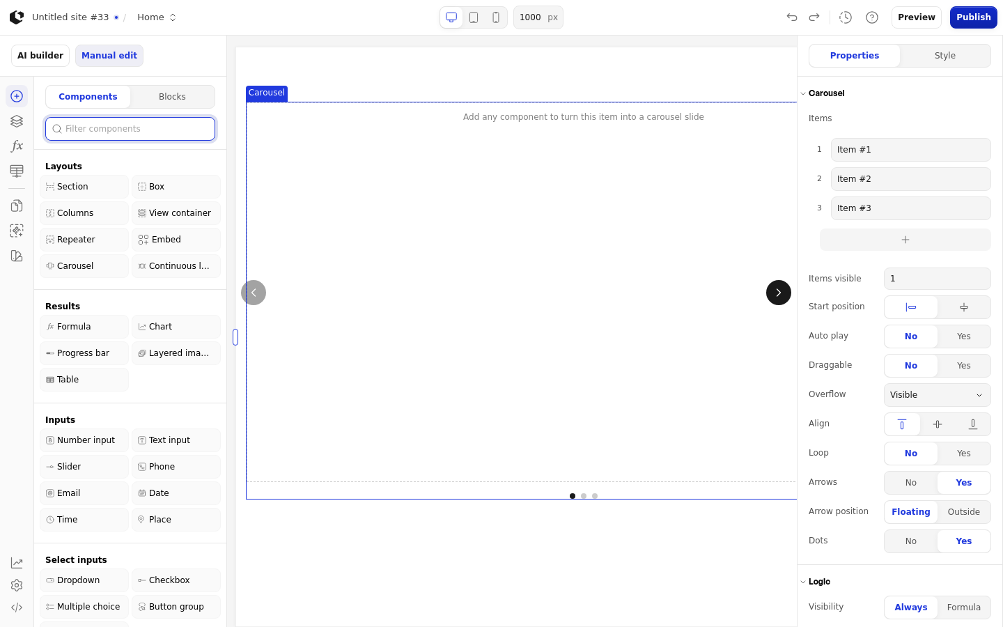
The properties live in the inspector under the Carousel group. The Interval field appears only when Auto play is on.
Property | What it does | Default |
|---|---|---|
Items | Custom item editor with the placeholder "Item name"; each item can be added before or after another item, or deleted | Empty |
Items visible | Number of items shown at once | 1 |
Start position | Where the carousel starts: left or center | Left |
Auto play | Moves through items automatically | Off |
Interval | Seconds between automatic moves; only available when Auto play is on | 5 |
Draggable | Lets visitors drag between items | Off |
Overflow | How items outside the visible area behave: Visible, Mask, or Hidden | Visible |
Align | Vertical alignment of items: top, center, or bottom | Center |
Loop | Wraps around to the first item after the last | Off |
Arrows | Shows arrow buttons to move between items | On |
Dots | Shows dot indicators for the items | On |
Logic | Visibility logic for the element | None |
Items visible accepts 1 to 4, and Interval accepts 1 to 100 seconds. Delete item is disabled when there is only one item left. In edit mode, an empty item shows "Add any component to turn this item into a carousel slide".
References
The Carousel has no data references, so its items and settings are not available as data in formulas.
Styling
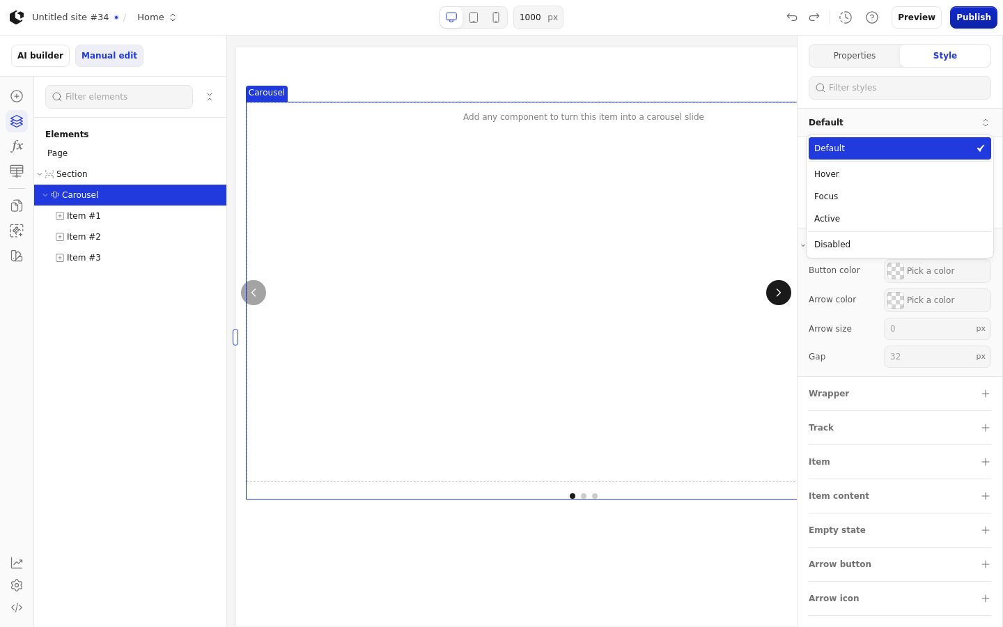
The Carousel can be styled per state and per part of the element.
Style states: Default, Active, Disabled, Focus, Hover.
Named targets: wrapper, track, arrow-button, arrow-icon, dots, dot.
Named style: Carousel (key carousel-default), set as default.
Quick styles: Button color, Arrow color, Arrow size, Gap.
Apply general styling from the Style tab: quick styles, style sets, and CSS overrides per state and per breakpoint. See the styling reference for the full system.
Related articles
UI Elements: overview of the elements.
FormulaScript Overview: using formulas in properties.