
Image
The Image element shows a picture from an asset, a URL, or a Formula. Use it for a product image, a logo, a feature visual, or a layer in a configurator.
Properties
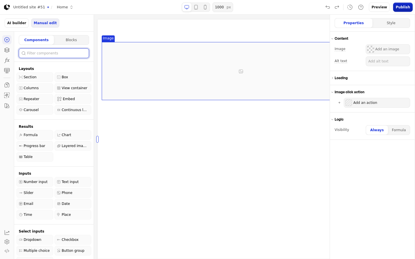
The properties live in the inspector under the Image group.
Property | What it does | Default |
|---|---|---|
Image | Source of the picture: an asset, a URL, or a Formula | None |
Alt text | Alternative text for the picture | None |
Lazy loading | Loads the picture only when it scrolls into view | Off |
Image click action | Runs an action when a visitor clicks the picture | Empty |
Logic | Shows or hides the element based on a condition | Always |
Lazy loading and Image click action appear only in the Site editor. In the Document editor, the Image group has just Image, Alt text, and Logic.
References
The Image element has no references, so it exposes no data for formulas or other elements. A missing source shows an image placeholder instead of a picture.
Styling
The Image can be styled per state and per part of the element.
Style states: Default, Hover.
Named targets: wrapper, image.
There is no named Image style set. In the Site editor the default image override is width 100%, height auto, object-fit cover, and overflow hidden. In the Document editor the quick styles are Width, Height, Object fit, Border radius, Margin, and Aspect ratio.
Apply general styling from the Style tab: quick styles, style sets, and CSS overrides per state and per breakpoint. See the styling reference for the full system.
Related articles
UI Elements: overview of the elements.
FormulaScript Overview: using formulas in properties.