
No. Upload the original image. The CDN compresses it at quality 85 and serves each visitor a copy in the size their screen needs, never larger than the original.
Image optimization on published sites
Images on a published site are optimized automatically: ConvertSite serves every picture compressed, in a modern file format, and in exactly the size the visitor's screen needs. There is nothing to configure, and you don't have to compress or resize images before uploading them.
Are images compressed automatically?
Yes. The ConvertSite CDN re-encodes every JPG, PNG, WebP, GIF, and AVIF image it serves, with a fixed quality of 85 (on the usual 0–100 scale). The quality level is not configurable. SVG files and images embedded from other hosts are delivered unchanged.
What this means for speed tests like Lighthouse
Speed tests such as Google Lighthouse flag images that are oversized, uncompressed, or served in an inefficient format. Published ConvertSite pages cover all three automatically: every image is served at the size that fits, compressed at quality 85, and in the best format the visitor's browser supports.
How the right size is chosen
When you publish, ConvertSite calculates how much space each image takes up: the column widths, padding, and maximum content width around it, separately for mobile, tablet, and desktop. The calculation is stored with the page, and the CDN serves a matching copy for each size. A visitor's browser downloads only the copy that fits its screen, so a phone visitor gets a smaller file than a desktop visitor. Sizes exist in fixed steps from 64 up to 4096 pixels wide, and an image is never enlarged beyond its original upload.
Where the sizing applies
The space an image occupies is worked out for the layouts where images commonly appear:
Pages and sections: the image fills the space left by the section's padding and maximum content width, at every breakpoint.
Columns: on desktop the image matches its column's share of the row. When columns stack on mobile or tablet, the image uses the full width.
Carousels: the image matches the width of one carousel item. Mobile shows one item; on tablet and desktop the number of visible items you configured applies.
Continuous loops: the image matches the width of one item, the same way as a carousel. On mobile a horizontal loop shows at most 3 items; a vertical loop gives each item the full width.
Which file format is served
The CDN picks the best format the visitor's browser supports: AVIF first, then WebP, and the original format when the browser supports neither. JPG, PNG, WebP, GIF, and AVIF images get this treatment. SVG images are served as-is, because they scale on their own.
Images filled by a Formula
An image whose source comes from a Formula, such as a product picture pulled from a table, is included in the first load of the published page. It used to appear only after the page finished loading, sometimes showing as broken or empty first. Each row in repeated content gets its own correctly sized image, and the image keeps the loading choice you made, including Lazy loading on the Image element.
What you can still control
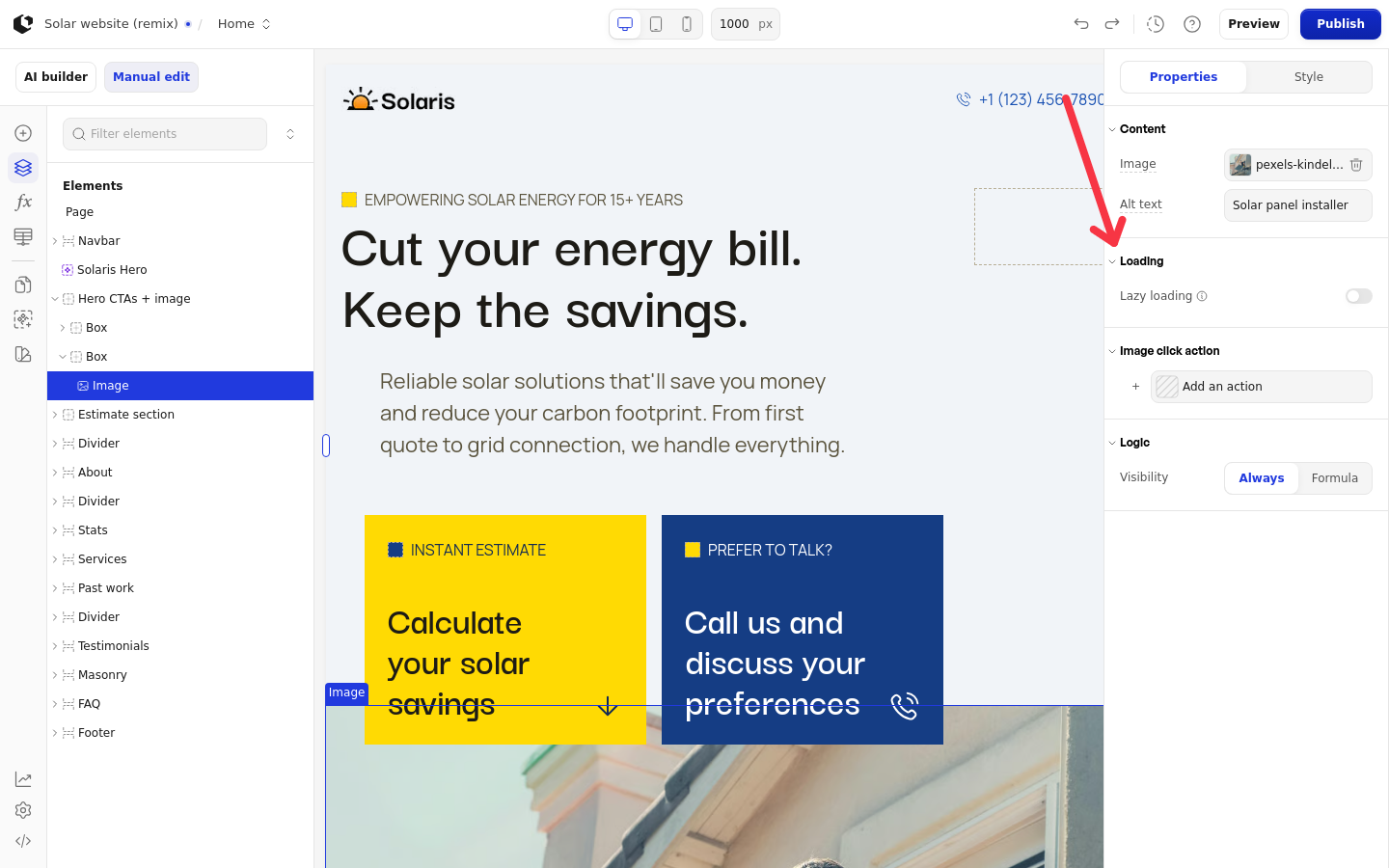
Sizing, compression, and format are automatic. The one delivery setting you control is Lazy loading on the Image element (Site editor only): it makes an image wait to load until it scrolls into view. See the Image article.
Do I need to compress or resize images before uploading?
Was this helpful?
Was this helpful?