
Expandable box
The Expandable box shows a Base that visitors see and interact with, plus a Panel of content that opens from it. Use it for contextual menus, mega menus, and floating docks. You can add it in the Site and Embed editors under Components, in the Layouts group; the Document editor does not include it. For a plain container that does not open a Panel, use a Box instead.
Add an Expandable box
Open Components and choose the Layouts group.
Click Expandable box to add it to the page.
Adding it creates two permanent slots: a Base and a Panel. You cannot remove, move, or duplicate either slot on its own.
Base and Panel
The Base is the part visitors see and interact with, such as a button, icon, or text. The Panel is the content that opens from it.
A new Base fits its content, so a centered Panel opens below the button instead of in the middle of a full-width Base. The parent and Panel wrapper widths keep the ordinary Box defaults.
Position the Base
In the Base placement group, Position places the box in the page or at a fixed corner. The options are In page, Top left, Top center, Top right, Bottom left, Bottom center, and Bottom right. Choosing a fixed corner position reveals Offset, a value in px.
Configure the Panel
In the Panel placement group you control where the Panel opens and how wide it is.
Placement: Top, Right, Bottom, or Left.
Alignment: Left, Center, or Right.
Gap: the distance from the Base, in px.
Width: Fit content, Percentage or pixels, Same as expandable box, or Same as base.
Choosing Percentage or pixels reveals Width value, a number with a unit selector that offers Percentage and Pixels. A custom Panel width accepts only pixels or a percentage of the app viewport.
Set how the Panel opens
The Interaction group controls when and how the Panel appears.
Open on: Hover or Click. Choosing Hover reveals Open delay and Close delay, both in ms.
Overlay: a color control.
Transition: None, Fade in/out, Height, Slide in from top, Slide in from bottom, Slide in from left, or Slide in from right. Any transition except None reveals Transition time, from 0 to 1000.
Visibility
The Logic group holds Visibility, with the choices Always and Formula. Choosing Formula reveals the formula field. The parent box and the Base have this control; the Panel does not.
Placement and interaction settings are shared: editing them on the Base or the Panel writes to the parent Expandable box. Visibility and styles stay on the component you select.
Edit the Panel content in isolation
Edit the Panel on its own, without the rest of the page in the way.
In the Navigator, open the menu of the Panel you want to edit.
Choose Edit content.
Edit the Panel. The editor shows an Editing panel mode while you work in isolation.
When you finish, return to the owning page or Block.
Open and close the Panel with a click action
The Toggle Expandable box panel action opens or closes the Panel of the Expandable box you pick, when a visitor clicks the element it is attached to.
Select the element that will toggle the Panel.
In the inspector, scroll to that element's click action group and click Add an action.
Pick Toggle Expandable box panel from the picker, or type in the
Search actionfield to find it. It sits between Navigate to carousel item and Fetch table.In the action's configuration panel, use the Expandable box selector to choose the box whose Panel the action opens or closes. Its placeholder reads
Select an Expandable box.
The selector lists the Expandable box components in the current root component tree, excluding Blocks.
If the Expandable box is hidden by Hide on scroll, opening its Panel keeps it visible while the Panel is open, even when the visitor has not scrolled it into view. The hold also applies to a Block instance that directly contains the box, and it ends when the Panel closes.
This hold does not override the Visibility setting: a box hidden by its Show formula stays hidden, and a formula that hides the box closes an open Panel.
How visitors interact with the Panel
The Panel opens on hover or click, as you configured, and touch toggling works on touch devices.
Keyboard access is supported. Pressing Escape closes an open Panel and restores focus to its opener.
Panels can be nested, and their positioning avoids collisions.
Form values inside the Panel are preserved.
Overlays and transitions apply as configured.
Examples
Three common builds: a mega menu, a contextual menu, and a floating dock.
A mega menu
Our own website's mega menu is an Expandable box: the menu item in the top navigation is the Base, and the panel of grouped links that opens below it is the Panel. An overlay dims the page behind the Panel while it is open.
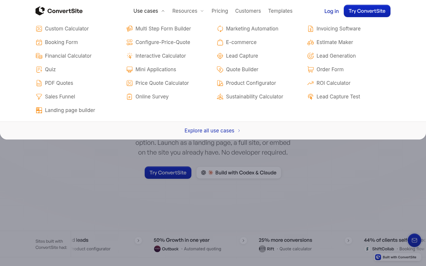
To build one, put the Base in the header and set Placement to Bottom. Give the Panel a wide custom width under Percentage or pixels, choose Hover under Open on, and pick an overlay color in Overlay.
A contextual menu
Give a help button its own corner: set Position to Top right and add an Offset. The Panel opens Bottom with Width set to Fit content, holding a short list of contact options. Set Open on to Click. Pressing Escape closes the Panel again.
A floating dock
Pin a chat or booking button to a fixed corner of the page with Position set to Bottom right and an Offset, and let the Panel open above it with Placement set to Top. On touch devices, visitors toggle the Panel with a tap.
Styling
Apply general styling from the Style tab: quick styles, style sets, and CSS overrides. See the styling reference for the full system.
Related articles
UI Elements: overview of the elements.
How click actions work: where click actions live and how to add one.
Box: the plain container without an opening Panel.