
Columns
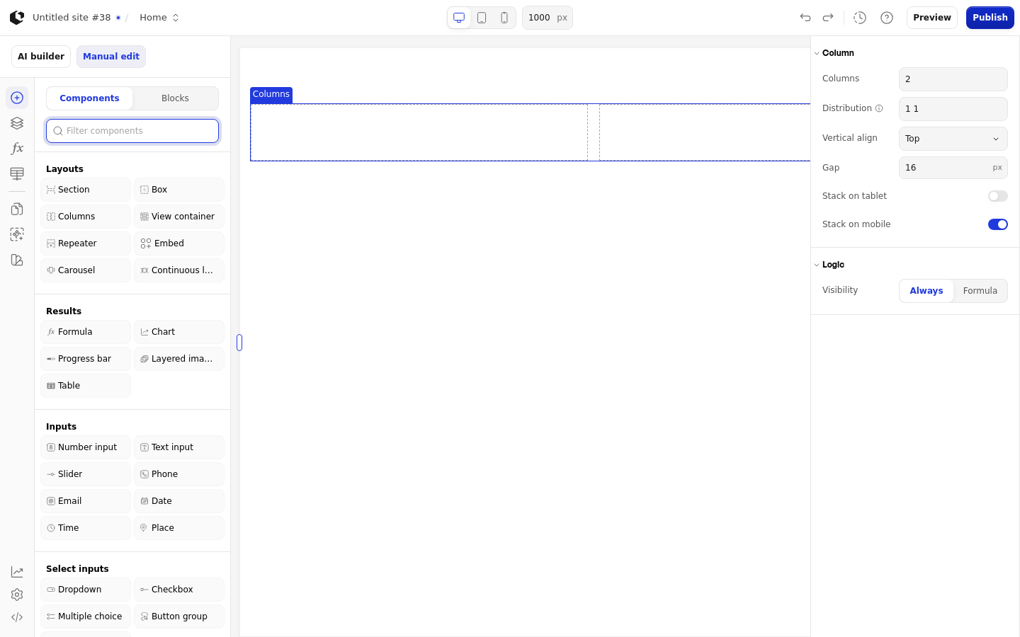
The Columns element creates a column layout with configurable distribution and responsive stacking. Use it to place content side by side, for example two columns with an explanation on the left and a quote form on the right.
Properties
The properties live in the inspector under the Columns group. Stack on tablet and Stack on mobile are site-only properties and are absent in the Document editor.
Property | What it does | Default |
|---|---|---|
Columns | Number of columns in the layout | 2 |
Distribution | Widths of the columns, for example "1 1" for two equal columns | "1 1" |
Vertical align | How columns align vertically | Top |
Gap | Space between the columns, in px | 16 |
Stack on tablet | Stacks the columns on tablet screens (site only) | Off |
Stack on mobile | Stacks the columns on mobile screens (site only) | On |
Logic | Visibility logic that controls when the columns are shown | Empty |
Columns has a minimum of 1 and Gap accepts values from 0 to 100. The Distribution field shows the placeholder "1 1" until you enter a value. The Columns field shows 2 when the element is empty; with existing child columns it shows the current count. Reducing the number of columns can show the message "If you remove this column, it's content will be deleted." with Cancel and Remove.
References
The Columns element has no data references. It exposes no values for use in formulas or other elements.
Styling
The Columns element has no own state constant or named style set for the container, and its only internal styling target is the wrapper. The Style tab is fully hidden in the Document editor, and there is no Site quick-style provider for Columns.
Columns has no editable style surface of its own in the Document editor. A Column is a structural child of the layout, not a palette element, so styling applies to the individual columns rather than to the Columns element itself.
Related articles
UI Elements: overview of the elements.
FormulaScript Overview: using formulas in properties.