
Text
The Text element shows a paragraph or label of text. Use it for an explanation, terms, instructions, or a description next to an input.
Properties
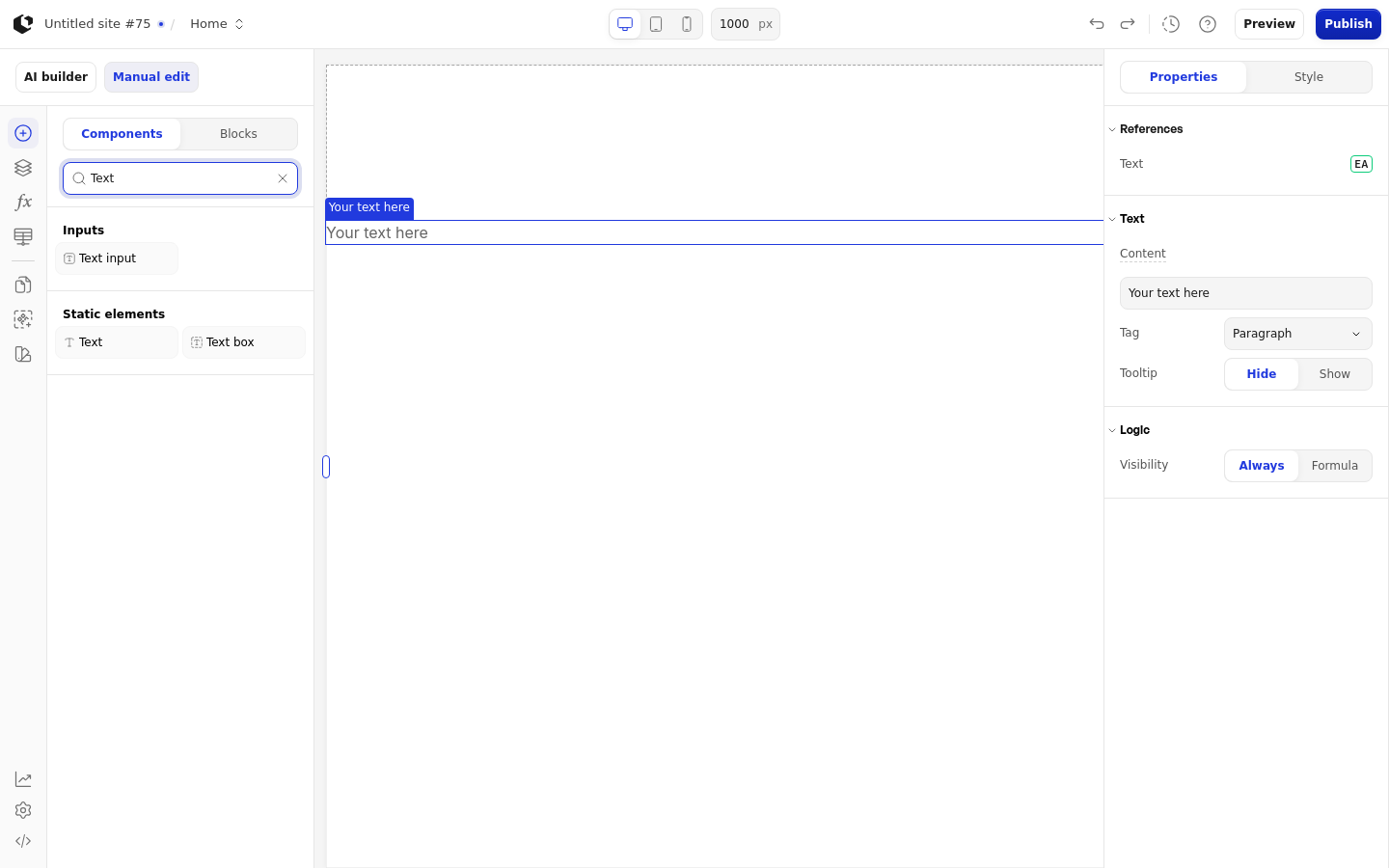
The properties live in the inspector under the Text group. Tag and the tooltip fields appear only in the Site editor; the Document editor omits them.
Property | What it does | Default |
|---|---|---|
Content | The text shown, entered as text or a Formula | Your text here |
Tag | The HTML tag used for the text: Paragraph, Label, or Span | p |
Tooltip | Shows a tooltip icon next to the text | hide |
Tooltip icon | The icon shown when Tooltip is set to show | untitled-ui/info-circle |
Tooltip content | The tooltip text shown when Tooltip is set to show | Tooltip content |
Tag and the tooltip fields are absent in the Document editor. Content accepts text or a Formula. A Logic group controls when the element is visible.
References
References expose the rendered text as data you can use in formulas and other elements. Assign a reference to store the text value in a variable.
Text: the rendered text value.
Styling
The Text element can be styled per state and per part of the element.
Style states: Active, Default, Hover.
Named targets: wrapper, text, tooltip-icon, tooltip-content.
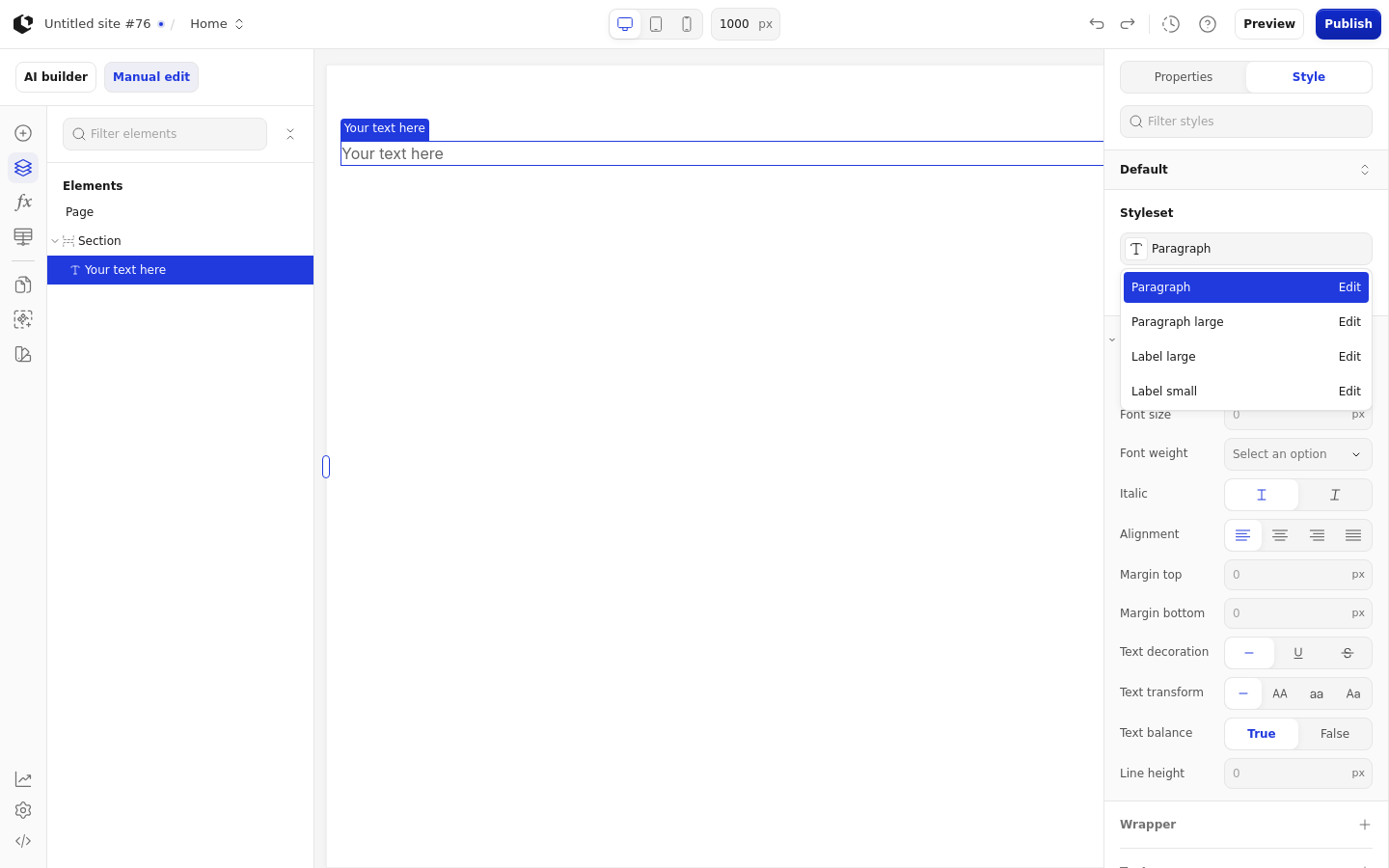
Named styles in the Site editor are Paragraph, Paragraph large, Label large, and Label small. In the Document editor the named styles are Paragraph and Paragraph Small.
Apply general styling from the Style tab: quick styles, style sets, and CSS overrides per state and per breakpoint. The quick styles are Color, Font size, Font weight, Italic, Alignment, Margin top, Margin bottom, Text decoration, Text transform, Text balance, and Line height. See the styling reference for the full system.
The Document editor has no style-state selector, so states cannot be styled separately there. When Text is a child of a TextBox, it loses its references and tooltip controls.
Related articles
UI Elements: overview of the elements.
FormulaScript Overview: using formulas in properties.